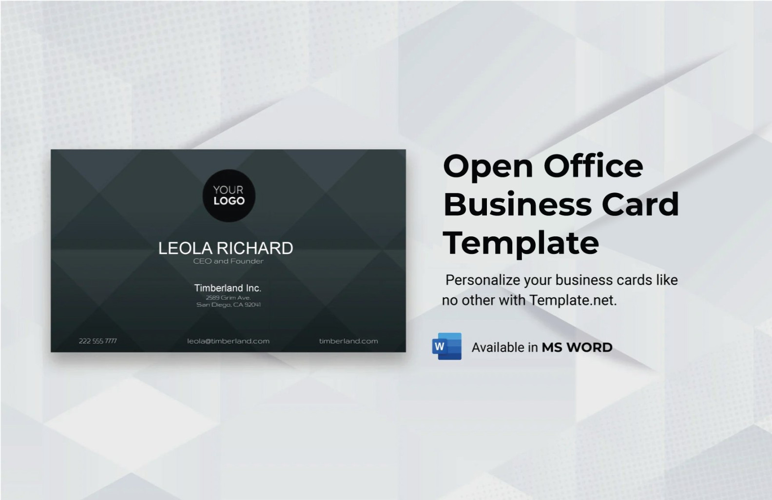
OpenOffice, a free and open-source office suite, offers a powerful tool for creating professional business Cards. By understanding the essential design elements and following these guidelines, you can craft a visually appealing and informative business card that reflects your brand identity and leaves a lasting impression.
Font Selection
The choice of font significantly impacts the overall appearance and readability of your business card. Opt for fonts that are clean, legible, and consistent with your brand’s personality. Consider using a combination of serif and sans-serif fonts for a balanced and visually appealing design. Serif fonts, such as Times New Roman or Garamond, are often preferred for their traditional and formal appearance, while sans-serif fonts like Arial or Helvetica offer a modern and clean aesthetic.

Color Scheme
A well-chosen color scheme can enhance your business card’s visual appeal and reinforce your brand identity. Select colors that complement each other and evoke the desired emotions or associations. Consider using a limited color palette to maintain a cohesive and professional look. For example, a combination of navy blue and gold can convey a sense of luxury and sophistication, while a green and white palette may suggest environmental awareness.
Layout and Composition
The layout of your business card should be well-organized and easy to read. Ensure that the information is clearly arranged and avoids clutter. Consider using a simple and clean layout, such as a vertical or horizontal orientation. The placement of elements should be balanced and visually appealing. Avoid using excessive text or graphics that may overwhelm the design.
Text Content
The text content on your business card should be concise and informative. Include essential information such as your name, job title, company name, contact details (phone number, email address, website), and any relevant social media handles. Use a clear and consistent font size and style for all text elements. Consider using a slightly larger font size for your name and job title to make them stand out.
Graphics and Imagery
Graphics and imagery can add visual interest and enhance your business card’s design. Choose images that are relevant to your business or industry and avoid using low-quality or blurry images. Consider using a company logo or a simple graphic element that complements your brand identity. Ensure that the graphics are well-integrated into the overall design and do not detract from the readability of the text.
Paper Quality and Printing
The quality of the paper and printing significantly impacts the perceived professionalism of your business card. Opt for a high-quality paper stock that is thick and durable. Consider using a matte or linen finish for a more sophisticated appearance. Choose a reputable printing service that offers high-resolution printing and accurate color reproduction.
Additional Considerations
By carefully considering these design elements and following the guidelines provided, you can create professional business cards that effectively represent your brand and make a positive impression on your target audience.